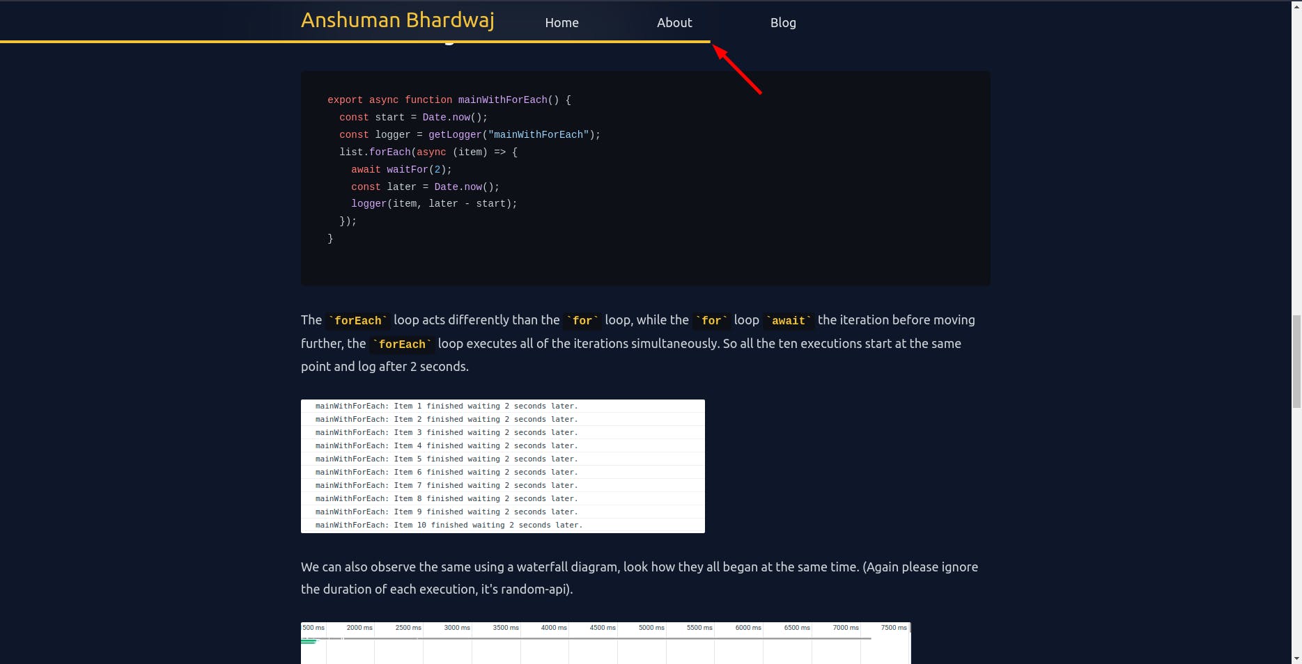
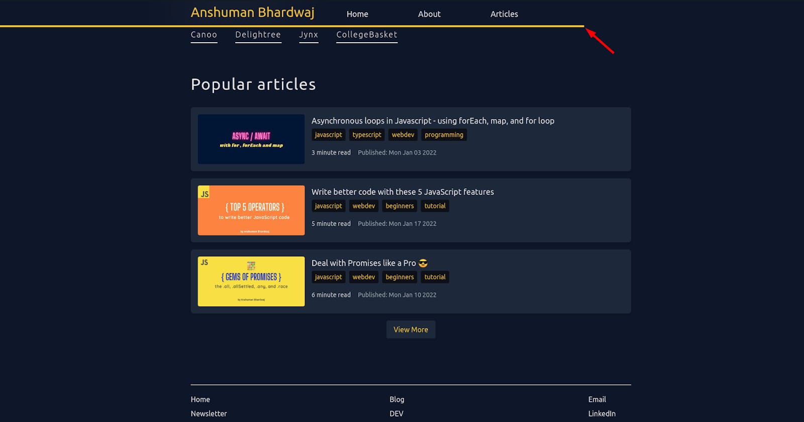
Recently, I was reading one of my favorite author's articles on his website. I realized he has a reading progress bar at the top, which helps gauge how much of the article is left to read.
I thought this makes for a good user experience, and I should add this to my articles on my personal website as well. So, I went ahead and did it.
Breakdown
- Find how much a user can scroll down on this page.
- Find how much the user has scrolled down on the page.
- Get the ratio by dividing the later by the former.
Voila, there we have our scroll percentage aka "reading progress".

Code snippet
import { useEffect, useState } from "react";

/**
 * React Hook to get the scroll percentage from the page, returns a value from 0 to 100
 */
export function useReadingProgress() {
  const [completion, setCompletion] = useState(0);
  useEffect(() => {
    function updateScrollCompletion() {
      // see how much we have scrolled
      const currentProgress = window.scrollY;
      // see how much total scroll is available
      let scrollHeight = document.body.scrollHeight - window.innerHeight;
      if (scrollHeight) {
        setCompletion(
          Number((currentProgress / scrollHeight).toFixed(2)) * 100
        );
      }
    }
    // add scroll event listener
    window.addEventListener("scroll", updateScrollCompletion);

    // remove scroll event listener on umount
    return () => {
      window.removeEventListener("scroll", updateScrollCompletion);
    };
  }, []);
  return completion;
}
The rest of the work is to show this information on the UI, for that, I just show a progress bar on the NavBar up top.
Styling
I use TailwindCSS for my website and it was very easy to make this progress bar with it
export default function NavBar() {
  const completion = useReadingProgress();
  return (
    <nav className="sticky z-50 top-0 backdrop-blur-3xl py-2">
      <span
        id="progress-bar"
        style={{
          transform: `translateX(${completion - 100}%)`,
        }}
        className={`absolute bottom-0 w-full transition-transform duration-150 h-1 bg-yellow-400`}
      />
      {/* Rest of the NavBar */}
    </nav>
  );
}
We use the transform and translate CSS properties to make the UI for the progress bar.
The #progress-bar is by default exists at the bottom of NavBar but by using translateX we move it across the X-axis.
Because we do translateX(${completion - 100}%)
- At 0% progress, it translates -100% on the X-axis, making it disappear
- At 100% progress, it translates 0% on the X-axis, showing it fully
That's it for now. I hope you find this article helpful! Should you have any feedback or questions, please feel free to put them in the comments below, I would love to hear and work on them.
For more such content, please follow me
Until next time

